Silverlight Roller Blind
The free Roller Blind control is a simple control that lets you group related controls together and hides them from the display until the user hovers the mouse over the Blind. At this point the Blind rolls open automatically showing the controls for the user to manipulate. This control helps you build an easy to use and clutter free GUI and is especially useful for reducing screen space needed.
This Silverlight only Roller Blind Control is easy to implement on your Silverlight driven website and is also customizable to provide a visual feel suitable for any site design.
To use the Roller Blind control you will need to add a reference to Liquid.dll in your project.
 You need to login to Download the Roller Blind example, If you do not have a login you can register for free!
How to Use the Roller Blind Control
To use the Roller Blind on your Silverlight page:
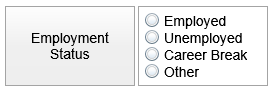
In your C# code behind file you can refer to the Roller Blind using currentStatus. In this example we create a simple Roller Blind containing a set of Radio Buttons.
As you can see the visuals for both the front and behind of the Blind are easy for you to customize in the XAML.
Example Silverlight Roller Blind Control:
Further Information
Guide the car to its parking space in this fun Car Parking game.

Aim for the Trash Can and get the various items of Trash in the bin.
Fly your plane in this colorful vertical scrolling shoot-em-up. Blast the bad guys and collect any bonus's they leave behind.
Pop as many bubbles as possible in this fun and colorful bubble popping game. The levels start off easy enough but gradually get harder!
Here we have a bunch of monsters that need to be matched up. Look out for the bomb and spinning monsters that will cause special damage!

Guide your friendly Bird through the maze of pipes and other obstacles collecting the Stars in this cool arcade game inspired by the legendary Flappy Bird.
You are stranded on an Alien planet. Your goal is to build a space rocket and escape. Start by building units to create power and mine the metal patches. Build defenses to defend your base from the advancing Aliens and Zombies!

Play Pool against the computer or battle against your friends in the online mode!
Slice the fruit that is thrown up onto the screen. Slice the fruit into multiple pieces for maximum points!