Silverlight Viewer

The Viewer control provides a method for the user to not only scroll some piece of content using a pair scroll bars but also drag the content around with the mouse and also to zoom in and out of the content.

This Silverlight only Viewer Control is easy to implement on your Silverlight driven website and is also customizable to provide a visual feel suitable for any site design.

To use the Viewer control you will need to add a reference to Liquid.dll in your project.

How to Use the Viewer Control

To use the Viewer on your Silverlight page:

<UserControl x:Class="Viewer.Page"
    xmlns="http://schemas.microsoft.com/winfx/2006/xaml/presentation"
    xmlns:x="http://schemas.microsoft.com/winfx/2006/xaml"
    xmlns:extended="clr-namespace:System.Windows.Controls;assembly=System.Windows.Controls"
    xmlns:liquid="clr-namespace:Liquid;assembly=Liquid"
    xmlns:liquidRichText="clr-namespace:Liquid;assembly=Liquid.RichText"
    Width="800" Height="600">
    <Grid>
        <Grid.ColumnDefinitions>
            <ColumnDefinition />
            <ColumnDefinition Width="4" />
            <ColumnDefinition />
        </Grid.ColumnDefinitions>
        <liquid:Viewer Grid.Column="0" Minimum="0.4" Maximum="5">
            <liquidRichText:RichTextBlock Width="600" RichTextURL="assets/RichText.xml" />
        </liquid:Viewer>
        <extended:GridSplitter x:Name="grsplSplitter" Grid.Column="1" VerticalAlignment="Stretch" HorizontalAlignment="Center" Width="4" Margin="0 2 0 2" Background="#00ffffff" />
        <liquid:Viewer Grid.Column="2">
            <Image Source="assets/reef.jpg" />
        </liquid:Viewer>
    </Grid>
</UserControl>
 

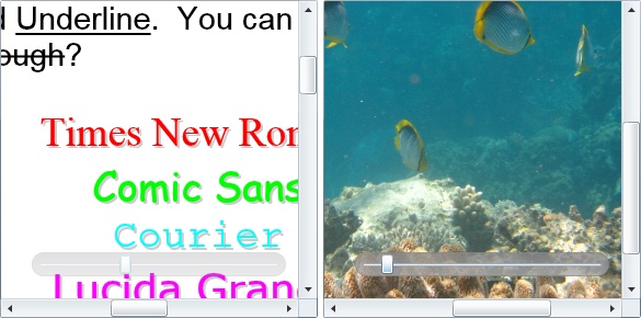
In this example we have two Viewer controls, the left control contains a Rich TextBlock and the right an image. The Viewer control has the ability to zoom in and out of the content, this is achieved using the Slider control which appears at the bottom of the Viewer.

The level of zooming can be controlled by setting the Minimum and Maximum properties. You can also control the current zoom level programatically by setting the Zoom property.

To pan around the content the mouse is clicked and dragged around, the speed of this can be changed using the DragSpeed property.

using System;
using System.Collections.Generic;
using System.Linq;
using System.Net;
using System.Windows;
using System.Windows.Controls;
using System.Windows.Documents;
using System.Windows.Input;
using System.Windows.Media;
using System.Windows.Media.Animation;
using System.Windows.Shapes;
namespace Viewer
{
    public partial class Page : UserControl
    {
        public Page()
        {
            InitializeComponent();
        }
    }
}
 

Example Silverlight Viewer Control:

Silverlight Viewer Control

Your Comments and Questions Answered

 You are not logged in. You need to login to post new messages, if you do not have a login you can register for free!

vitthalgb28 said:

while using image control it shows me the error
AG_E_NETWORK_ERROR
Image error.
please tell me the mistake and what code should i do to fix the bug.

06/11/2009 02:28
 
dan said:

Sure, the trick is to use multiple Rectangle elements with some clever use of opacity settings. Here I will post the XAML for the vectorlight logo so you can see how it's just a bunch of overlayed rectangles:

<Grid x:Name="logo" Width="166" Height="92" Cursor="Hand" MouseLeftButtonDown="Grid_MouseLeftButtonDown">
     <Rectangle StrokeThickness="2" Stroke="#7070a0" RadiusX="8" RadiusY="8">
         <Rectangle.Fill>
                <LinearGradientBrush StartPoint="0.5,0" EndPoint="0.5,1">
                     <GradientStop Color="#ff686868" Offset="0.0" />
                     <GradientStop Color="#ff3D3C3C" Offset="0.2" />
                     <GradientStop Color="#ff060505" Offset="0.4" />
                     <GradientStop Color="#ff2E2F2F" Offset="1.0" />
                </LinearGradientBrush>
         </Rectangle.Fill>
     </Rectangle>

     <StackPanel Margin="8 0 0 8" VerticalAlignment="Bottom" Orientation="Horizontal">
         <Image Margin="2" Source="images/treeview.png" Opacity="0.8" Stretch="None" />
         <Image Margin="0 2 0 2" Source="images/mark.png" Opacity="0.6" Stretch="None" />
         <Image Margin="2 2 0 2" Source="images/mark.png" Opacity="0.4" Stretch="None" />
         <Image Margin="2 2 0 2" Source="images/mark.png" Opacity="0.3" Stretch="None" />
         <Image Margin="2 2 0 2" Source="images/mark.png" Opacity="0.2" Stretch="None" />
         <Image Margin="2 2 0 2" Source="images/mark.png" Opacity="0.1" Stretch="None" />
     </StackPanel>

     <Rectangle x:Name="greenRect" StrokeThickness="0" RadiusX="8" RadiusY="8">
         <Rectangle.Fill>
                <RadialGradientBrush x:Name="greenBrush" GradientOrigin="0.9,0.9" Center="0.5,0.5" RadiusX="1.0" RadiusY="1.0">
                     <GradientStop Color="#dd88ff88" Offset="0.0" />
                     <GradientStop Color="#0088ff88" Offset="0.3" />
                     <GradientStop Color="#0088ff88" Offset="1.0" />
                </RadialGradientBrush>
         </Rectangle.Fill>
     </Rectangle>
     <Rectangle x:Name="redRect" StrokeThickness="0" RadiusX="8" RadiusY="8">
         <Rectangle.Fill>
                <RadialGradientBrush x:Name="redBrush" GradientOrigin="0.9,0.9" Center="0.5,0.5" RadiusX="1.0" RadiusY="1.0">
                     <GradientStop Color="#88ff0000" Offset="0.0" />
                     <GradientStop Color="#00ff0000" Offset="0.3" />
                     <GradientStop Color="#00ff0000" Offset="1.0" />
                </RadialGradientBrush>
         </Rectangle.Fill>
     </Rectangle>
     <Rectangle x:Name="blueRect" StrokeThickness="0" RadiusX="8" RadiusY="8">
         <Rectangle.Fill>
                <RadialGradientBrush x:Name="blueBrush" GradientOrigin="0.9,0.9" Center="0.5,0.5" RadiusX="1.0" RadiusY="1.0">
                     <GradientStop Color="#880000ff" Offset="0.0" />
                     <GradientStop Color="#000000ff" Offset="0.3" />
                     <GradientStop Color="#000000ff" Offset="1.0" />
                </RadialGradientBrush>
         </Rectangle.Fill>
     </Rectangle>
     <Rectangle x:Name="yellowRect" StrokeThickness="0" RadiusX="8" RadiusY="8">
         <Rectangle.Fill>
                <RadialGradientBrush x:Name="yellowBrush" GradientOrigin="0.9,0.9" Center="0.5,0.5" RadiusX="1.0" RadiusY="1.0">
                     <GradientStop Color="#88ffff00" Offset="0.0" />
                     <GradientStop Color="#00ffff00" Offset="0.3" />
                     <GradientStop Color="#00ffff00" Offset="1.0" />
                </RadialGradientBrush>
         </Rectangle.Fill>
     </Rectangle>
     <Rectangle x:Name="whiteRect" Margin="1" StrokeThickness="1" Stroke="#ffffff" RadiusX="8" RadiusY="8">
         <Rectangle.Fill>
                <RadialGradientBrush x:Name="whiteBrush" GradientOrigin="0.9,0.9" Center="0.5,0.5" RadiusX="1.0" RadiusY="1.0">
                     <GradientStop Color="#ddffffff" Offset="0.0" />
                     <GradientStop Color="#00ffffff" Offset="0.7" />
                     <GradientStop Color="#00ffffff" Offset="1.0" />
                </RadialGradientBrush>
         </Rectangle.Fill>
     </Rectangle>

     <TextBlock x:Name="shadowText" HorizontalAlignment="Center" VerticalAlignment="Top" Margin="2 12 0 0" FontFamily="Arial" FontSize="32" Foreground="#88000000" Text="vectorlight">
     <TextBlock.RenderTransform>
         <ScaleTransform ScaleX="1" ScaleY="1.1" />
     </TextBlock.RenderTransform>
     </TextBlock>
     <TextBlock HorizontalAlignment="Center" VerticalAlignment="Top" Margin="0 10 0 0" FontFamily="Arial" FontSize="32" Text="vectorlight" Foreground="#ffffff">
     <TextBlock.RenderTransform>
         <ScaleTransform ScaleX="1" ScaleY="1.1" />
     </TextBlock.RenderTransform>
     </TextBlock>
     <TextBlock HorizontalAlignment="Right" VerticalAlignment="Top" Margin="0 46 11 0" FontFamily="Arial" FontSize="14" Foreground="#88000000" Text=".net" />
     <TextBlock HorizontalAlignment="Right" VerticalAlignment="Top" Margin="0 45 12 0" FontFamily="Arial" FontSize="14" Foreground="#888888" Text=".net" />
</Grid>

04/07/2009 04:01
 
tbeacleay said:

<slightly-off-topic>I’m familiar with the technique for getting the “searchlight” effect on a surface using a RadialGradientBrush and a timer to move it around. I can’t figure out how you guys have multiple ones on your logo. I tried adding multiple background brushes but that doesn’t work. I don’t suppose you could give me a quick 1-line answer for an approach to doing that?</slightly-off-topic>

04/06/2009 06:27
 
dan said:

Hi manickasudar,

Thanks for reporting this bug. It has been added to the fix list and will be fixed in the next version of the controls. Thanks again!

02/27/2009 06:49
 
manickasudar said:

Hi
i am using viewer control with one image.
Minimum=0.05
Maximum=5.0
When I set zoom=0.3 the image gets zoomed but the slider is in the same position..
How to change the slider value dynamically....

02/26/2009 10:30
 
dan said:

Hi Martin,

Yes, we've got exactly what you've mentioned, a method to scroll to a child UI element and scrolling by increments. This should be what you're looking for. It'll be in the next version due out at the end of February!

02/07/2009 08:23
 
dan said:

Hi Tom,

I'm not sure you can do this easily directly with the Slider control, but you can have a try using the style. We may be able to add an extra property that allows this to happen but cannot guarantee this a the moment. Thanks!

02/07/2009 08:20
 
ToT said:

Hi, Dan
Thanks.
I have a question. It doesn't seem possible to hook to the Slider control. I'd like to change the Slider behavior and make it a bit more 'natural', which means that moving one unit to the right should zoom to 200%, and moving one unit to the left should zoom to 50%, etc.

I guess that should be possible by changing a template, but perhaps there's an easier way ?

Thanks, Tom

02/05/2009 10:08
 
martinoosthuizen said:

Hi there.

Thanks for all the updates. Looking forward to the next update of the Viewer. It's beautiful so far.
I just wanted to check...
What about scrolling methods, like to scroll to a particular control inside the Viewer.
And also to scroll to a position in the box, or by increments / decrements.
Are things like in the pipeline.

Really good work on this lib, thanks again.
Martin

02/05/2009 02:42
 
dan said:

Hi Tom,

Hopefully we can get the next version completed by the end of February. Thanks for your patience!

02/04/2009 01:05
 
ToT said:

Hello
Thanks for this nice control. However, I have the same problem as Martin below, so I'd like to know when do you plan the next version.

Thanks, Tom

02/04/2009 09:20
 
dan said:

Hi Martin,

Thanks for bringing this up, there is a problem in the current version which will be fixed for the next version. Thanks again!

01/21/2009 01:16
 
martinoosthuizen said:

Hi there.

The Viewer control works nicely on a canvas, at a fixed size, but acts quite unstable when placed inside a grid.
It would be useful to be able to stretch the Viewer into a Grid.

Is there another way to get the Viewer to Auto-stretch?

And will the Alignment properties work in the next version?

Very nice library!
Martin

01/18/2009 05:07

Silverlight 3

Latest News

  • Silverlight 2 Controls V5.2.1 Released
    Jul, 03 2009

    After several months since the last release we have implemented many fixes to the controls library. The Rich TextBox has been improved with Links...

  • Silverlight 3 BETA Controls Released
    Mar, 30 2009

    As Silverlight 3 BETA is available now to test we thought we would present the Liquid Controls library for Silverlight 3. This BETA...

Silverlight 2 Controls

  • Rich TextBox

    Create and edit rich content with this slick and expandable Rich TextBox...

  • TreeView

    This easy to use TreeView comes with drag and drop, sorting, searching and much more...

  • Context Menu

    You too can have cool popup context menus in your Silverlight applications...

  • Resizable Dialog

    Draggable and resizable popup dialogs are what serious Silverlight developers need...

  • Spell Checker

    Real-time spell checking in Silverlight? We did it first here...